Near Telluride
©2011 Steve Penberthy
Watercolor on Strathmore Gemini 140-lb CP paper
15" x 11" (38.1 x 27.9 cm)
I've travelled to
Telluride, Colorado many times, and it is one of the most scenic areas I've ever visited. This view is of a valley meadow just west of town, looking to the east towards the San Juan Mountains and the end of the box canyon in which Telluride is located.
(view a photo of this scene from Google Maps)
I painted this scene from a photo I took a few years ago; I was drawn to the scene by the intense blue of the summer sky contrasted against the billowy clouds. I'd love to say that I just sat down at the paper and, with photo reference at my side, splashed some paint and out came a finished work. Far from the truth. It was a long road to get this painting to a composition with which I was satisfied.

First, I drew a pencil drawing of the scene, and I really liked the dark sky contrasting with the clouds; I knew that the focal point of the painting had to be a spot in the sky with the most contrast between dark and light. In fact, the drawing really didn't come together until I added very strong darks in the sky.
So, using my pencil sketch as a roadmap, I made an initial quarter-sheet painting. And I hated it. I mounted another quarter sheet to my board and painted it again. A little better this time, but I hated this second one also. I decided to let it sit for a day or so, so I could "walk around it" so to speak. In the past, I've had some success in getting a painting to a finished state by letting it lay dormant for a short time, allowing me time to gain some needed objectivity for the things I couldn't see (or think of) during the heat of the painting battle.
So, after a day or so, I looked at the painting again, and made a list of what I thought was wrong or needed correction:
1. I had failed to get my focal point across; I didn't have enough contrast between dark and light in the sky.
2. There wasn't much value contrast in the painting as a whole; it was largely middle values.
3. There was no light; no life. It looked flat.
4. The colors were muddy.
5. I had imprecise edges on the mountains from errant brush strokes and bleeding of the paint.
I started drawing value sketches--a lot of value sketches. I explored compositional changes, alternatives in value dominance, and even played with the idea of adding some close trees in the foreground as a new center of interest:
 |
Thumbnail exploring compositional
and value alternatives |
 |
Should I add a tree in the
foreground as a focal point? |
 |
Third set of thumbnails exploring
compositional and value alternatives.
Finally--I like the one in the lower
right-hand corner!
|
 |
Prototype on
iPhone Brushes app |
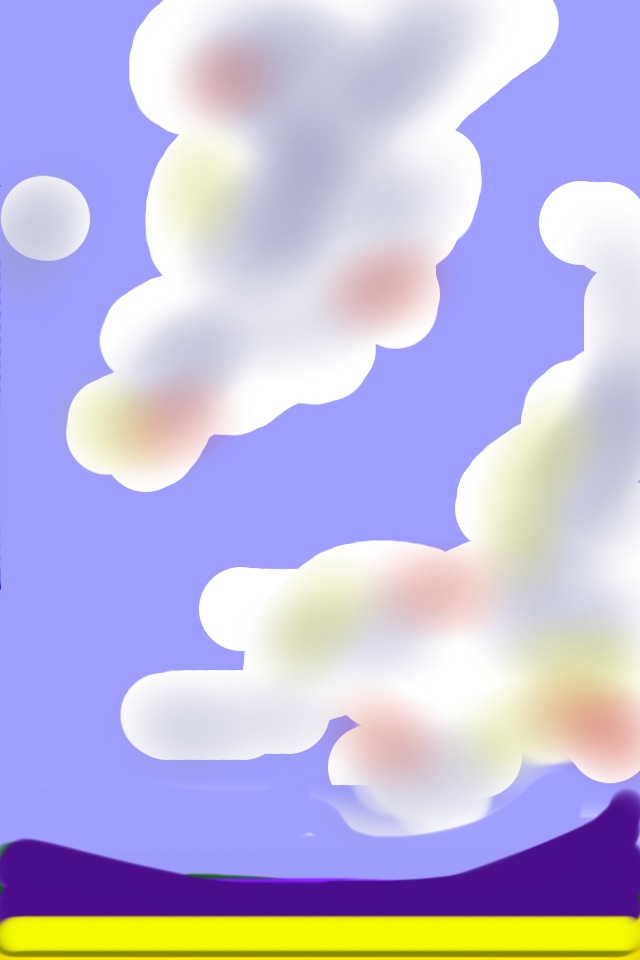
I finally decided that, instead of making the mountains a middle value (as they were in the photo), I would represent them as a dark, thin shape. The skies would remain a middle value, the foreground a light value (the yellow I used in the final painting reads as a light value), and the clouds my lightest. To test whether this made sense using color, I quickly prototyped the painting using the
Brushes app on my iPhone, as shown at left.
Finally satisfied with the values and composition, the painting came together. And I addressed the muddy colors by giving my palette and brushes a much-needed cleaning.
It was a fun day in the studio, but it was the work of the initial attempts, objective analysis, and thumbnail sketches that brought it all together.
I don't go through this process with all of my paintings; in fact, I probably did a better job than I ever have at trying to critically analyze what wasn't working. I learned a lot!
Enjoy!
Steve