Navigation

Sunday, July 19, 2009

Watercolor Painting :: Rose

Steve Penberthy - Watercolor Painting of a Yellow Rose - Version 1 of 2
"Rose"
11" x 15" (28 x 38 cm)
Watercolor on Strathmore Gemini 140-lb CP paper
© 2009 Steve Penberthy


I painted this rose from a photo that I took at the Missouri Botanical Garden a few years ago. I've never really attempted to paint any florals formally, so this I guess is my first try. I thought this rose might afford me some opportunities to practice my unifying and separating wash technique that I learned in Laurie Humble's workshop.

This was a challenging painting, and I have mixed feelings about the results; I feel like I succeeded in a couple of areas but the exercise quickly revealed that I also have a lot of room for improvement and learning in other areas.

I did two paintings of the same subject; the first one appears above. On the second, I tried to get a little looser, rely on building up layers/glazes, and go lighter on the values. The second attempt appears below. I'm really not sure which one I like better; they both have pros/cons to them.

Steve Penberthy - Watercolor Painting of a Yellow Rose - Version 2 of 2
I guess the thing I came away with is that I've got a lot to learn, and I learned a lot already by attempting this challenging subject.

I've got other stuff to look at on Flickr.

Wednesday, July 15, 2009

Watercolor Workshop: Organizing Lights and Darks (Value Studies)


I attended Ratindra Das' workshop titled, "Organizing Lights and Darks (Value Studies)" at the Learning & Product Expo - Art! in Chicago on Saturday, July 11.

This was a timely workshop since paying more attention to value is something on which I have been working to improve. Das' instructional style is deliberate and unhurried, and he explained his concepts with great detail and patience.

It appeared that Das must be currently working on a book; he reinforced his topics with examples and images using a Word document on his laptop that he projected onto the front wall of the classroom. The Word doc was arranged into chapters...

Das spends much more time with his value sketches than he does with the formal painting. He works using only about four or five values; he mentioned that only about twenty actually exist in nature. He cautioned all of us not to confuse value with "shading." Values that are close to each other "mumble," that is, they're not clear; as few as three clear values speak loudly. Shapes that are close in value in a painting are muddy. He further taught that light creates the passages, darks create the linkages, and the middle values hold the painting together. Our goal was to make patterns in our value work by being mindful of these concepts.

The demonstration portion of the workshop began by Das showing us extensive examples of value studies from his own sketchbooks, which were 8.5" x 11" and of the bound, hardback type featuring lightweight sketching paper (similar perhaps to the Canson basic sketchbook). I love getting to peer at other artist's sketchbooks, so this experience was a real treat for me. One of the key demos he performed was to create various value studies from existing sketches using tracing paper. For example, he chose an existing sketch of a lighthouse from his sketchbook that he did on location, which was merely an observational sketch without much initial value information. Laying the tracing paper over the existing sketch, he then experimented with the placement of new light and dark patterns. He explained how to create paths for the eye to follow using light passages. From this Das discussed the concept of "designing," which he defined as visually connecting the light values together. He further explained that artists must study "conceptual light" instead of relying solely on, for example, the sun in a photo (or lack thereof as in a photo taken on a cloudy day); he admonished us to "create your own light." This is the spirit of organizing lights and darks.

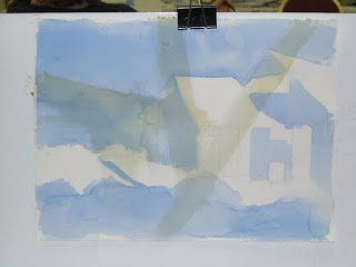
From a photo reference projected on the wall, we created our own observational sketch, then used tracing paper to play with our own value design. Das provided us with heavy-weight drawing paper, tracing paper, and a Cretacolor Monolith 9B woodless graphite pencil. From there, he passed out sheets of 140-lb Strathmore Gemini paper, and we progressed onto a watercolor painting using our value sketch. My work in progress appears here:


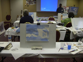
The only drawback to this particular workshop was that Das was perhaps not as organized as he could have been, and the lecture/demos extended two-thirds into the three-hour time period for the workshop; we only had about an hour to work on our sketches and painting, and sadly I had to leave before I was completely finished with my painting.

Steve Penberthy - Ratindra Das workshop in Chicago at Learning & Product Expo - Art!
Nevertheless, it was an awesome workshop experience from which I learned much; I soon hope to be incorporating the concepts I learned into my upcoming work. Please donĂ­t miss an opportunity to take a workshop from this great artist and instructor.

I've posted various other photos/snapshots from the workshop on Flickr.

Monday, July 13, 2009

Watercolor Workshop: The Secret of the Unifying Wash


"Matchsticks"
11" x 15" (28 x 38 cm)
Watercolor on Strathmore Gemini 140-lb CP paper
© 2009 Steve Penberthy


I did this still life painting as an exercise in a workshop taught by Laurie Humble titled, "The Secret of the Unifying Wash" workshop at the Learning & Product Expo - Art! in Chicago on Friday, July 10.

Laurie Humble is an extremely talented artist and a great instructor. She explains things very clearly, and interjects humor and personal stories into her teaching. She is very personable, friendly, and was a pleasure to work with. I felt that this workshop was worth the price of the entire weekend alone; I think Ms. Humble designed a very effective workshop that targets a very useful technique; one that I feel will take my work up a notch. Don't miss an opportunity to take a workshop from Laurie.

The official workshop description reads:
Watercolor is often called an unforgiving medium, but the unifying wash allows you to manipulate the depth of already painted elements. In this workshop, you will discover exactly what a unifying wash is and how to best use it to your advantage. Once you develop a true understanding of how to utilize this technique you will realize how much control you actually have over the final outcome of your work.

The core concept of the unifying wash (which Ms. Humble also calls a "separating wash") is that the unifying wash causes a focal point to emerge; it's a way to add realism and depth to your paintings. The unifying wash separates one element from another in a painting. It can be used on the shape that's "back" in order to bring another shape forward. To do this, a value change must be created everywhere there's a line where two shapes touch each other; not a colorchange necessarily, but a value change. Darker values cause things to look more pushed-back whereas lighter values cause things to come forward.

We first learned how to create a unifying wash by working on a "ribbon" exercise, one that she also features in her latest book, "Watercolor Depth and Realism." We drew random "ribbons" on a quarter-sheet of Strathmore Gemini 140-lb CP paper using two pencils that were held together with a rubber band separated by a scrap of sponge (to keep the pencils about a half-inch [1 cm] apart). Then, using any color we chose, we painted a unifying wash where the ribbons overlapped each other, causing one to visually emerge and the other to be pushed back. Here's a work-in-progress (WIP) photo of my ribbon exercise:


As a second exercise, we did a still life of some ordinary household matchsticks, the result of which is shown in the larger image above. We were each given about four or five matchsticks; Laurie asked everyone to "artfully arrange" the matchsticks, then do a pencil drawing on the quarter-sheet of watercolor paper. The arrangement of matchsticks affords many opportunities for overlapping and intersecting edges and lines, which is the whole point--lots of opportunities for unifying washes. This technique is especially useful in paintings with lots of detail, such as florals with foliage. The matchstick painting took me probably a little over an hour to do; when finished, I got a positive critique on it from Laurie.

The technique is really effective, and it's interesting that, even when you think you're finished, you can almost always go back into the painting and find new areas where the values need to be refined. This restating is often due to the paint drying at a lighter value than it was when it was wet.

I have other photos I took during the workshop on Flickr at http://www.flickr.com/photos/liquidchroma-/sets/72157621416275916/

Friday, July 03, 2009

Improve your art: 20 years’ of best tips and tricks from The Artist's Magazine


Just wanted to let you know about a great article that I found and didn't want you to miss it: Over at artistsnetwork.com, they're offering a free download of twenty years' worth of the best tips and tricks as a free .pdf. Tips are offered on a wide array of topics including:
- Boosting your creativity
- Landscape lessons
- Fashions for florals
- Drawing basics
- Block busters
- Oil options
- Medium methods
- Portrait pointers
- Techniques to know
- Solutions for still lifes
- Watercolor ways

The intro to the article states:
"For the last 20 years, The Artist’s Magazine has worked hard to help readers like you perfect your painting techniques. The helpful resources we provide issue after issue instruct aspiring artists in every subject, from tips on how you can create a useful reference sketch to information on how to frame your final piece. In honor of our anniversary, we’ve carefully scoured each and every issue to find what we believe to be the best advice for artists. So read on to review those pointers you learned from us in the past, and discover a few you might have missed the first time around."


Hope you enjoy the article as much as I did!